


Colour Psychology in Design: How to Evoke Emotions through Colours
Understanding the psychological impact of colors empowers us to create designs that resonate deeply with users and elicit specific emotional responses.

Introduction:
As visual designers, we possess a powerful tool that goes beyond aesthetics – the ability to evoke emotions through colours. Colour psychology is the study of how different colours can influence human emotions and behavior. Understanding the psychological impact of colors empowers us to create designs that resonate deeply with users and elicit specific emotional responses. In this article, I will delve into the fascinating world of colour psychology and discover how to effectively use colour theory to craft compelling design projects. Additionally, I am going to explore practical advice on selecting the right colour palettes for specific contexts.
The Power of Colour Psychology:
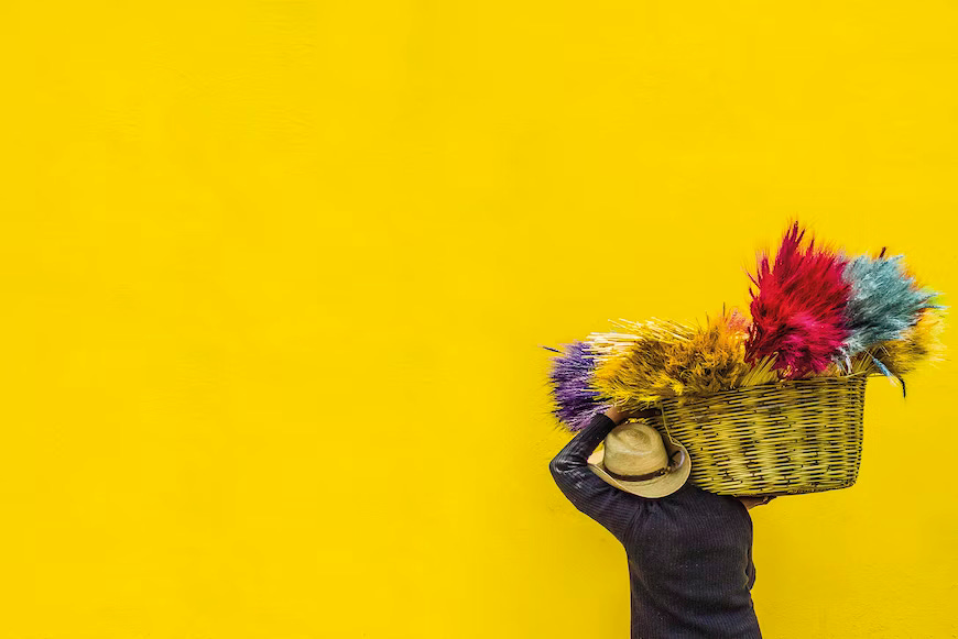
Colours have a profound impact on the human psyche. Each hue triggers distinct emotions, associations, and even cultural meanings. For instance, warm colours like red and orange evoke feelings of passion and excitement, while cool colors like blue and green promote calmness and relaxation. By understanding these emotional connections, visual designers can strategically choose colours to align with the desired mood and message of their designs.
Colour Associations and Cultural Influences:
Cultural backgrounds and personal experiences play a significant role in shaping individual color preferences and associations, particularly within African contexts. For example, while white traditionally symbolizes purity in certain Western cultures, it holds diverse meanings across various African societies. In some cases, white is linked to celebrations and unity, while in others, it may hold spiritual or ceremonial significance.
Given the rich tapestry of cultures and traditions across Africa, it becomes paramount to deeply consider the cultural context when making color choices. The potential impact of colours on diverse African audiences should not be underestimated. Designers working in or for African communities must be attuned to these nuances, ensuring that color selections are respectful and resonate positively with the intended viewers.
In the realm of design for African audiences, acknowledging the multiplicity of cultural interpretations attached to colors is a testament to the inclusive and thoughtful approach that leads to impactful and meaningful visual communication.
Applying Colour Theory:

Colour theory is the foundation of effective color usage in design. It comprises principles such as colour harmony, contrast, and complementary colours. By leveraging color theory, designers can create visually appealing and emotionally resonant designs.
a. Color Harmony: Harmonious colour schemes involve combining colours that are adjacent on the colour wheel, such as analogous or monochromatic schemes. These combinations create a sense of unity and balance in the design.
b. Contrast: Contrasting colours, such as complementary colours (opposite each other on the colour wheel), create visual interest and draw attention to specific elements. Skillful use of contrast ensures that important information stands out.
Choosing Color Palettes for Specific Contexts:
Different projects and industries demand unique colour palettes to evoke the intended emotions. Here are some practical tips for selecting the right colours for specific contexts:
a. Brand Identity: When designing for a brand, consider the company's personality and values. Select colours that align with the brand's identity and target audience. For example, a technology company may opt for modern and bold colors to evoke innovation and dynamism.
b. Website and App Design: For digital interfaces, prioritize usability and readability. Opt for a well-contrasted colour scheme that enhances legibility and guides users seamlessly through the design.
c. Marketing and Advertising: In promotional materials, use attention-grabbing colours that align with the campaign's message. Red, for instance, can evoke urgency, making it an excellent choice for limited-time offers.
d. Environmental and Spatial Design: When designing physical spaces, consider the emotions and experiences you want to evoke in the audience. Calming blues and greens may be ideal for a relaxation room, while vibrant colors can enhance energy in a fitness facility.
Conclusion:
As visual designers, we have the power to evoke emotions, influence behavior, and create meaningful connections with users through the strategic use of colours. By delving into the realm of colour psychology and mastering colour theory, we can craft designs that leave a lasting impact on our audiences. Whether it's designing a brand identity, a website, or a physical space, understanding the psychological impact of colours allows us to convey the intended message effectively and create designs that resonate deeply with users. So, let's embrace the art of colour psychology and elevate our designs to evoke emotions and inspire action.